Mastering User Experience: Essential Rules for Building Easy-to-Use Products
Product design rules I’ve learned to build easy to use products.
I often have to remind people some of the points below when it comes to UX, so I thought I’d document this on here.
Mastering User Experience: Essential Rules for Building Easy-to-Use Products
In the ever-evolving world of product design, creating user-friendly applications remains a paramount challenge. Over the years, I’ve distilled some key principles that consistently lead to more intuitive and enjoyable user experiences. Let’s explore these rules and see how they can transform your approach to product design.
1. Focus on Solving One Problem Exceptionally Well
The cornerstone of simplicity in app design is a laser-like focus on solving a single, specific problem. While the solution may involve multiple steps, your goal should be to minimize these steps as much as possible.
Take Uber, for example. Its primary function is to provide convenient transportation, and it excels by eliminating traditional pain points:
- No need to physically hail a taxi
- Automated payment system
- Real-time tracking of your ride
This streamlined approach is why Uber has become synonymous with ride-hailing services.
Human ingenuity has always been driven by the desire to automate tedious tasks and save time. Our inherent “laziness” is not a flaw but a wellspring of creativity. As behavioral economist Dan Ariely points out, “Laziness is built deep into our nature” [1]. This trait pushes us to find more efficient solutions to everyday problems.
For aspiring entrepreneurs, the key is not to reinvent the wheel but to identify common problems and optimize existing solutions. Snapchat’s initial success, for instance, came from addressing a simple yet crucial need: sharing photos without the risk of them being saved or redistributed.
2. One Purpose per Screen
Okay, I’m biaised because I love Mobile UX design over Desktop UX design. This is why when I start wireframing a new screen, I always start with the Mobile screen first.
Why? Because a common pitfall in UI design is cramming too much information or too many functions onto a single screen. When faced with this challenge, ask yourself:
“What is the user expecting to find on this screen, and what should their next action be? Why?”
Aim to dedicate at least 80% of the screen real estate to addressing these questions. The remaining 20% can be used for navigation and secondary options.
Research by the Nielsen Norman Group suggests that users typically spend only 10-20 seconds on a webpage before deciding to stay or leave [2]. Nowadays, that’s a lot of seconds! People’s attention span has decreased. This underscores the importance of clear, focused design that quickly communicates purpose and guides user action.
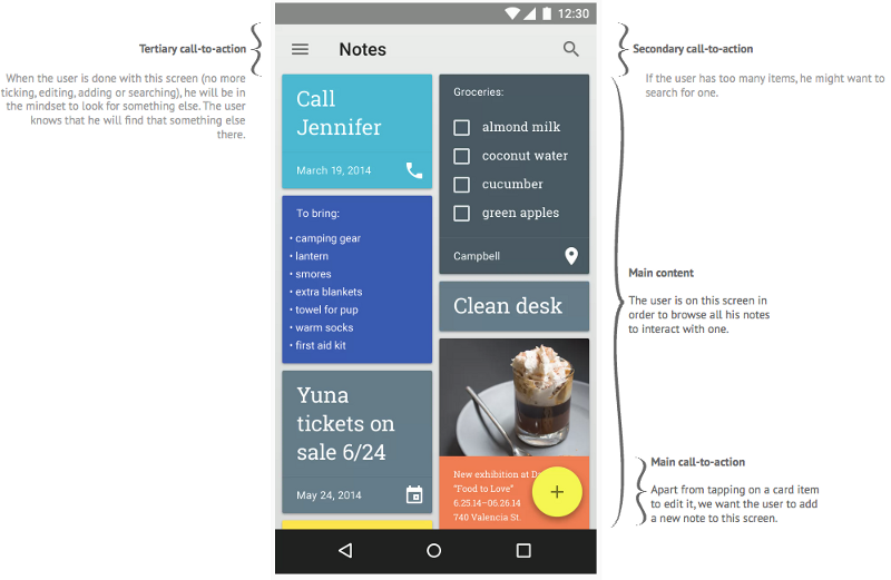
3. Prioritize User-Relevant Actions
When defining the main call-to-action (CTA) on a screen, adopt the user’s perspective. Prioritize user interests over company objectives. A simple way to prioritize actions is to ask, “How often will the user perform this action?”
While analytics provide the best insights, you can start with informed assumptions if data isn’t available. Just ensure you’re prepared to optimize based on actual usage patterns post-launch.
Let’s examine Google Keep, a note-taking app, as an example:
- Primary use case: Accessing existing notes
- Secondary use case: Adding a new note
- Less frequent use case: Accessing archived notes
The UI should reflect this hierarchy, with the two primary functions occupying about 80% of the main screen.
4. Nail the User Onboarding Experience
First impressions matter, especially in the digital world. User onboarding is crucial for retention, which is vital for any app’s success. However, many developers make critical mistakes during this phase:
- Forcing users through lengthy tutorials
- Overly explaining the product’s features
- Requesting payment upfront
- Demanding extensive profile setup
Instead, focus on getting users to experience your app’s core value as quickly as possible. This approach, known as the “Aha! Moment,” can significantly boost user retention. For instance, Facebook found that users who added 7 friends in 10 days were more likely to become long-term users <span class=”hint–top hint–rounded” aria-label=”Constine, J. (2011). Facebook’s “7 Friends in 10 Days” Rule Is the Secret of Successful Social Apps. TechCrunch.”>[3].
5. Thoughtful Navigation Design
The debate between dashboard layouts, hamburger menus, and tab bars continues in the UX community. Each has its merits depending on the app’s complexity and user needs.
Recent studies suggest that tab bars outperform hamburger menus in terms of discoverability and efficiency [4]. However, the best choice depends on your specific app and user base.
Conclusion
Creating an easy-to-use product isn’t about following a rigid set of rules. It’s about understanding your users, focusing on their needs, and continually refining your approach based on feedback and data. By adhering to these principles, you’re well on your way to creating products that users will love and continue to use.
Remember, the goal is not just to build a product, but to solve a problem in the most elegant and efficient way possible. As Steve Jobs once said, “Simple can be harder than complex: You have to work hard to get your thinking clean to make it simple.” [5]
References:
- Ariely, D. (2010). The Upside of Irrationality. HarperCollins. ↩
- Nielsen Norman Group. (2011). How Long Do Users Stay on Web Pages? ↩
- Constine, J. (2011). Facebook’s “7 Friends in 10 Days” Rule Is the Secret of Successful Social Apps. TechCrunch. ↩
- Pernice, K. & Budiu, R. (2016). Hamburger Menus and Hidden Navigation Hurt UX Metrics. Nielsen Norman Group. ↩
- Isaacson, W. (2011). Steve Jobs. Simon & Schuster. ↩